DailyBrief - Rethinking How Users Consume News
Designed the end-to-end product experiences to improve readability, engagement, and monetization across DailyBrief’s mobile app.
Industry
News & Media
Role
App Designer
Team
Solo
Timeline
2023 - 2024
Problem Overview
DailyBrief users mostly scrolled through long news and left without interacting. Important stories were hard to prioritized and no features for user interaction or to express opinions.
From a product point of view, this resulted in small sessions and no natural path to introduce paid value.
Objectives
Create a reading experience that helps users quickly filter through the daily updates, engage beyond just reading, and build long-term value through trust & relevance.
Outcomes
The redesigned experience made the feed easier to browse.
Enabled new interaction modes like audio, polls and discussions.
Improved relevance through user controls.
Introduced a clear, respectful subscription journey.
Design Strategy
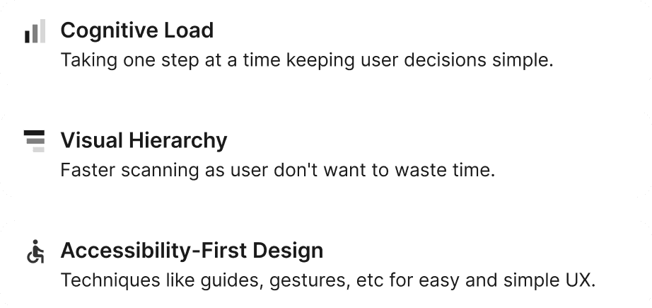
Instead of redesigning isolated screens, I focused on system-level improvements guided by these principles:
Features Delivered
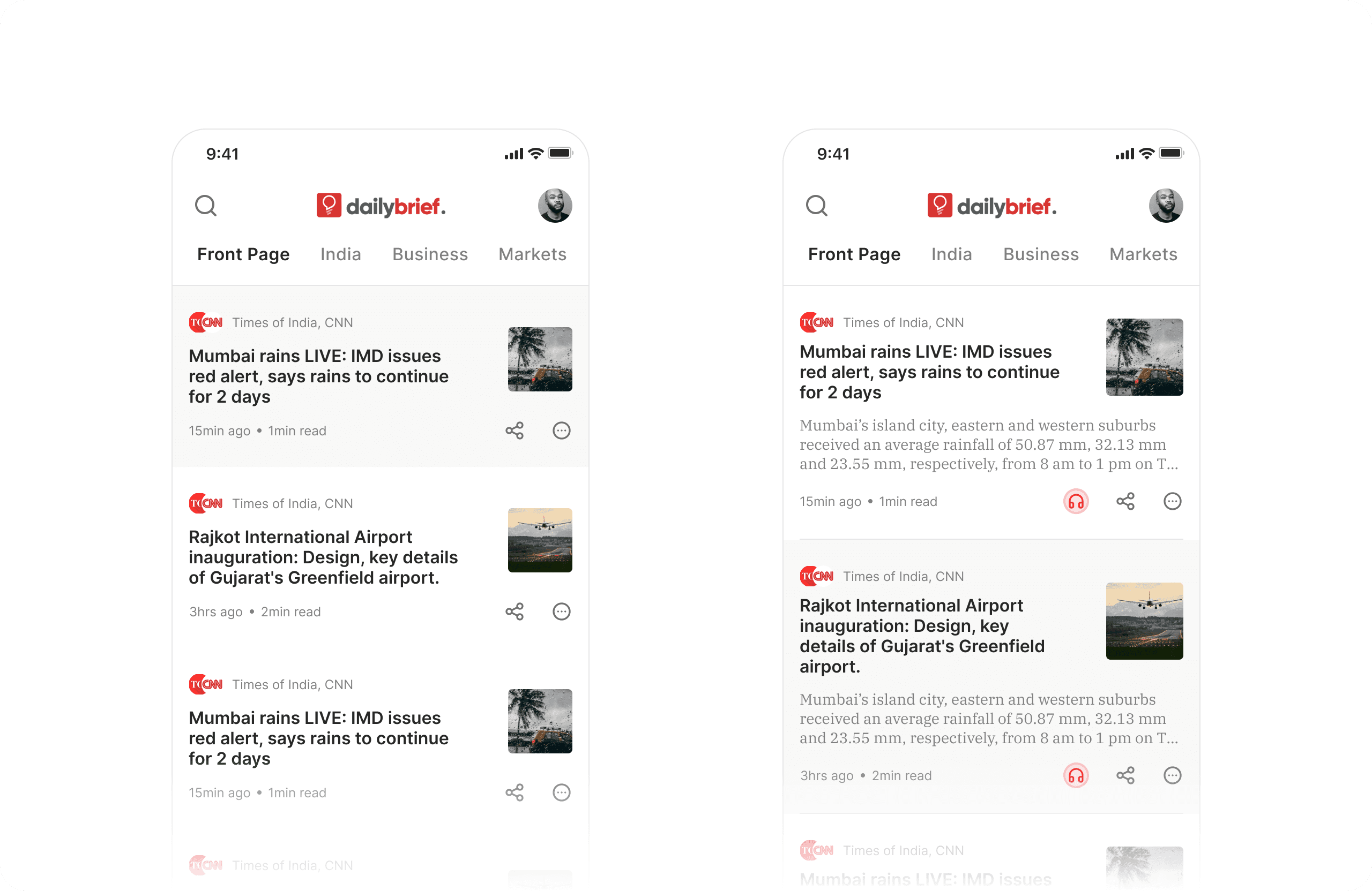
1. Reimagining the Home Experience
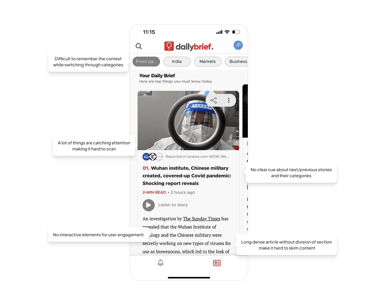
The home screen was the primary entry point but suffered from high cognitive load and low feature discoverability. Users had to scroll through long, dense content with little visual hierarchy and limited control over relevance.
I redesigned the home experience around a card-based feed structure to improve scanability and information scent. Clear spacing, typography hierarchy, and content grouping allowed users to quickly identify what matters.
Here are the 2 options that I created. One focussing just the headline and other with preview text for better depth.
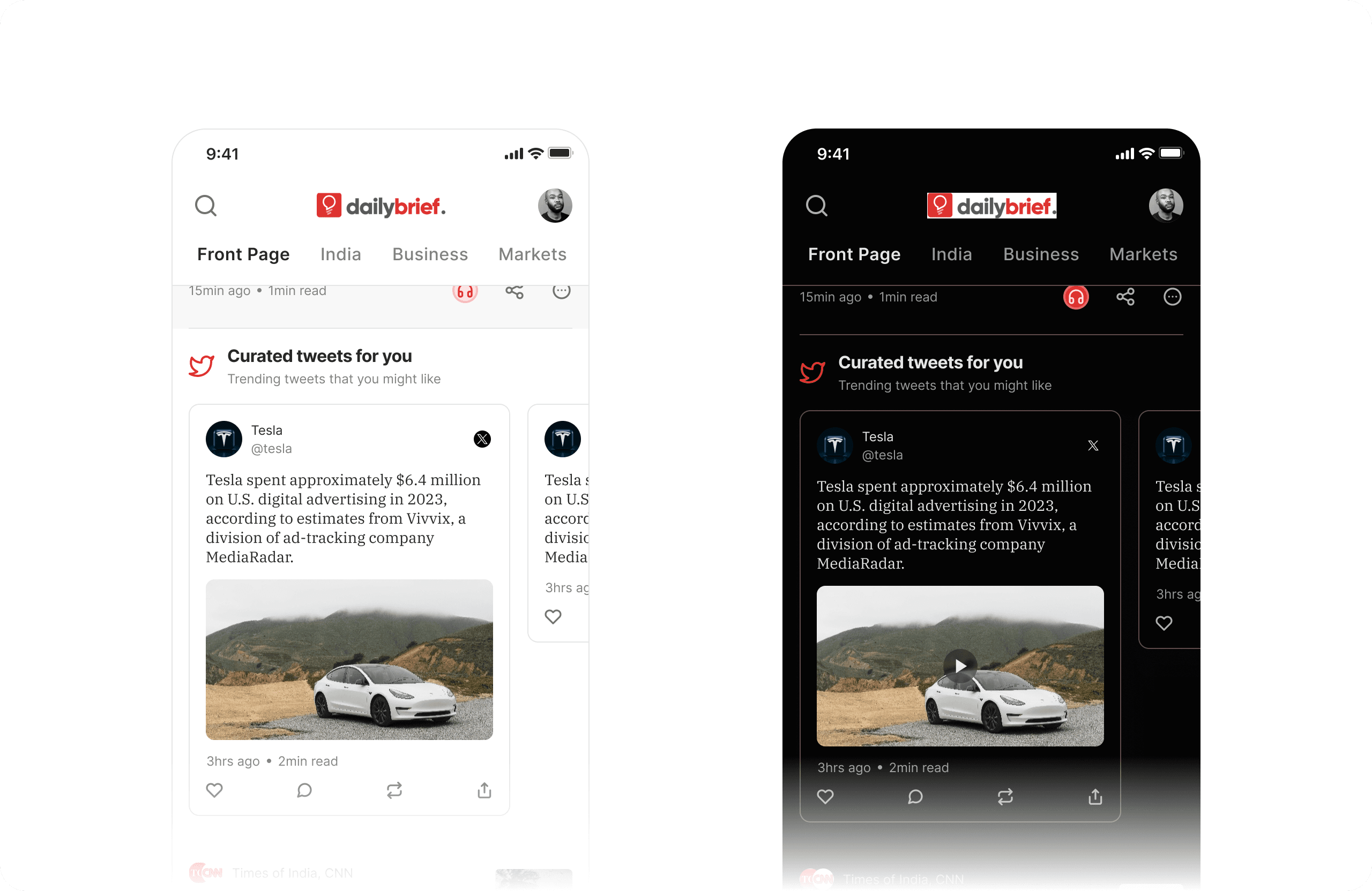
To add context and depth, I integrated curated tweets within relevant categories so users could see social signals without leaving the app.
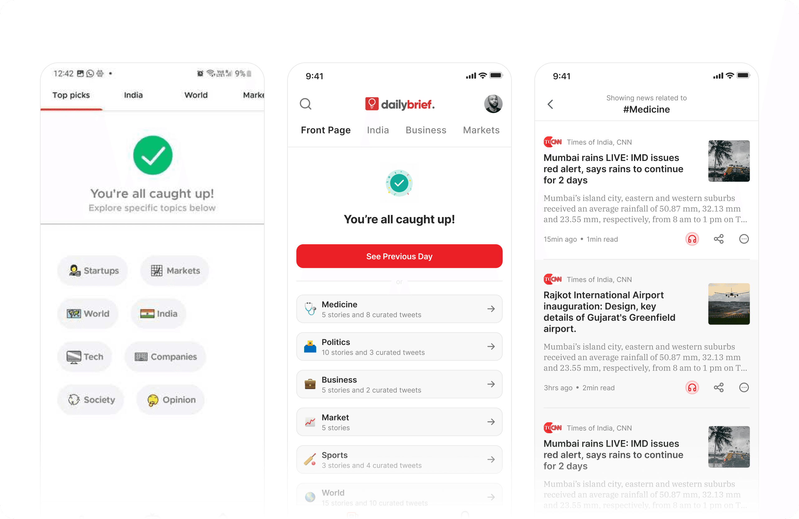
I also introduced a completion state with next actions, helping users understand when they were up to date and guiding them to continue exploration instead of hitting a dead end.
To improve learnability, contextual tooltips and swipe coaches were added, providing just-in-time guidance without cluttering the interface.
Finally, relevancy filters gave users control over the type of news they see, strengthening personalization and feed quality.
2. Enhancing the Article Reading & Interaction Experience
Reading an article was earlier a passive, linear experience with limited accessibility and engagement options.
We introduced Text-to-Speech to support hands-free and accessible consumption, with clear playback states and visibility of system status.
To encourage active participation, polls were embedded directly within articles, allowing users to share opinions and instantly view results, following principles of feedback and affordance.
Complex topics often raised follow-up questions, so we added in-article FAQs using anticipatory design to reduce context switching and cognitive load.
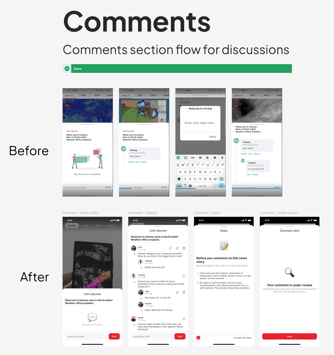
To support community interaction, we designed a full comments and moderation flow, including empty states, rules, and review statuses, ensuring psychological safety and transparency while encouraging healthy discussions.
3. Clarifying the Subscription & Monetization Flow
The subscription experience earlier lacked clarity around value and plan differences, which created hesitation and trust issues.
We redesigned the paywall and plan selection using strong visual hierarchy and progressive disclosure, clearly communicating benefits, pricing, and comparisons.
The flow was simplified to reduce decision fatigue, with clear call-to-actions and reassurance through transparent messaging. This aligned monetization with user value instead of interrupting the reading experience.